Flux Properties compared to Upton Sanderbeck
Transmitted Flux
First I compare the distribution of the transmitted flux, note that the fluxes have not been averaged in any way, the distribution is made from the transmitted flux of all the pixels of all skewers.
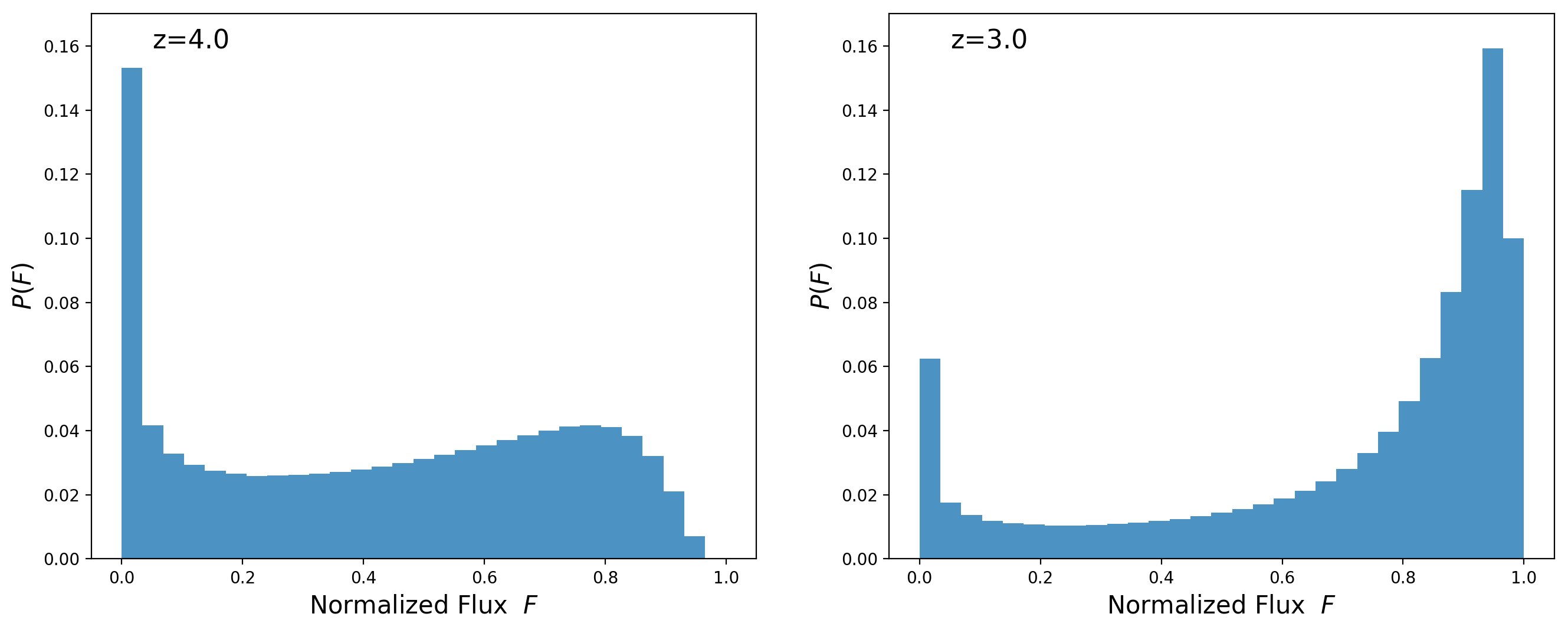
The distributions seems similar enough.
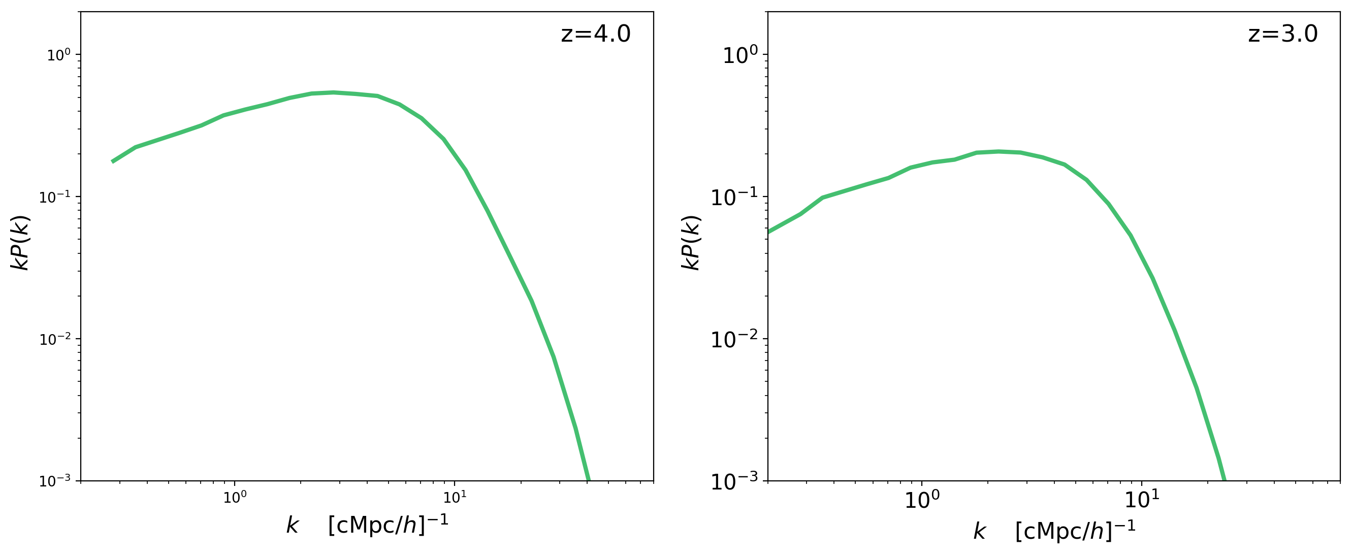
Flux Power Spectrum
Now I compare the flux power spectrum and their measurement is very different than mine. There are a couple things in their measurement that seem wrong:
-
Their \(k\) scale is too small, if correct the scales that they are plotting are ~30 Mpc/\(h\) to ~630 Mpc/\(h\), maybe they are missing a factor of 2\(\pi\) but still those would be large scales where the Flux power spectrum looks different.
-
Their measurements at both redshifts have very similar normalizations, this simply can’t be right because the average transmitted flux is smaller by a factor of ~2 going from z=3 to z=4